Studio (Identity)
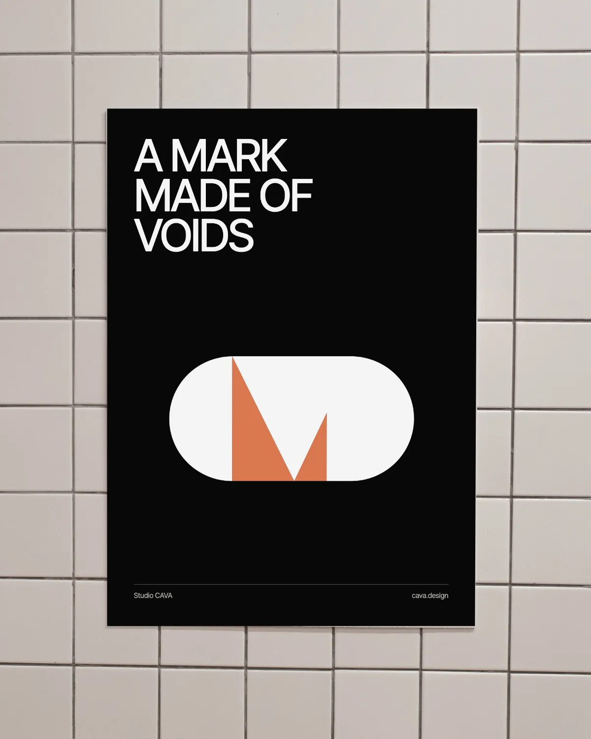
A markmade of voids
Our mark is two shapes and the space between them. This is how we got there, and the few rules we keep when we use it.
(01) The brief
Pure shapes, inside a square
We wanted a mark built from pure geometric figures, with nothing drawn by hand, that would sit inside a square at any size, from a sign at the gate of a site to the corner of a browser tab.
And we wanted it to say what we do. An architect works as much with the spaces left between things as with the things themselves.
(02) Twenty tries
From houses to a half circle
The first ideas were houses: four gables turning in a pinwheel, then a roof and a wall folded into letters. They said architecture too literally, and they lost their shape when small.
Cutting the forms into triangles brought us closer. The curve, at the end, settled it.
(03) C, V and two A's
Read the voids
The mark is a half circle and a triangle. The half circle is the C. The triangle leans away from it, and the white wedge that opens between them is the A: nobody drew it, it is the space the two shapes leave.
Written out in full, the word works the same way: the C, a void that reads as A, the V, and a last void, the final A.
Black: what we drew. Colour: what you read.
(04) Figure and ground
Why the eye fills in the A
Gestalt psychology, the Berlin school of the 1910s and 1920s, studied how we see wholes before parts. Two of its findings explain our mark. Figure and ground: the eye decides what is a shape and what is the space behind it, and can switch between the two, as in the vase Edgar Rubin drew in 1915, which is also two faces. And closure: we complete a shape that is only suggested, as in the triangle Gaetano Kanizsa drew in 1955, which nobody drew at all.
Graphic design has worked with both for a century. A mark built this way gives the reader something to find; the best known is the arrow hidden between the E and the x of FedEx, drawn by Lindon Leader in 1994. The pleasure is in the moment it appears, and once seen it cannot be unseen.
(05) Nolli's Rome
A city drawn in black and white
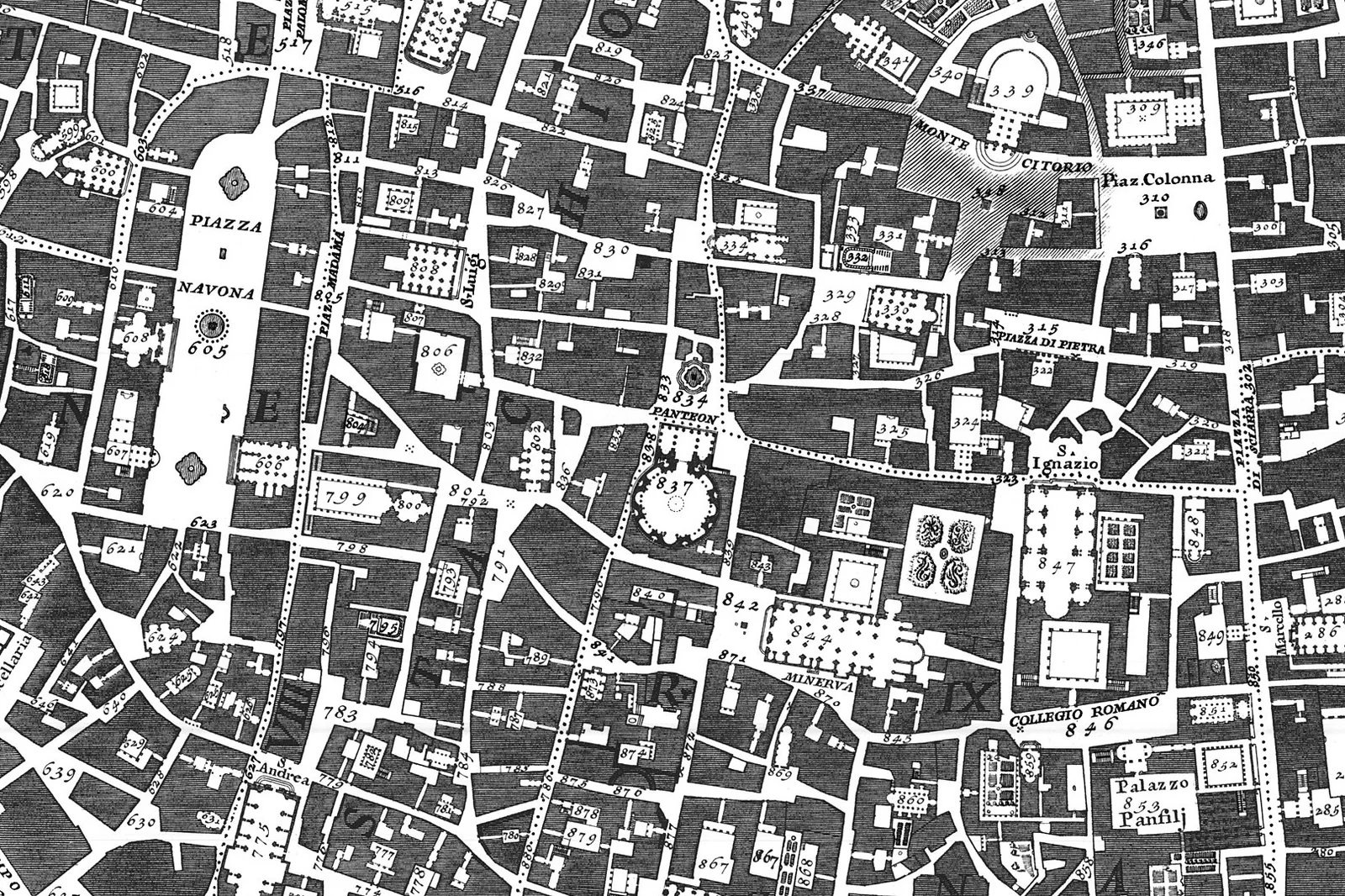
In 1748 Giambattista Nolli published a plan of Rome engraved on twelve copper plates, after twelve years of surveying. He drew every building in black and left in white everything a citizen could walk into: streets and squares, but also courtyards, porticoes and the interiors of churches. Public space became the figure, and the city could be read as one continuous room.
Architects have gone back to it ever since. In 1978 twelve of them, Aldo Rossi, James Stirling and Michael Graves among them, were each given one of Nolli's plates to redraw for the exhibition Roma Interrotta. The same year, Colin Rowe and Fred Koetter's book Collage City used figure-ground plans to argue that a city is made as much of its spaces as of its buildings.
We draw every lot this way before we design: the house in black, and in white the terraces, courtyards, deep eaves and breezeways where life in the tropics happens. In this climate the void is not what is left over. It is most of the house.
(06) The grid
A circle and half a rectangle
The half circle has a radius r. The triangle is half of a rectangle r wide and 2r tall, so it has the same height as the circle. Side by side, the two fill a square of 2r.
The diagonal runs at two to one, and the two shapes meet at a single point, at the top.
(07) The mark on its own
Black or white, nothing else
Black on white, or white on black. Never in colour, never outlined, never stretched.
Leave a clear space of half the radius on every side, and do not set it smaller than 16 pixels, the size of a browser tab.
(08) Type
Inter Tight
Words are set in Inter Tight, an open-source sans serif with short, close-set letters that hold up from a note on a drawing to a headline across a screen.
Labels go in capitals, in brackets, the way a drawing names its parts.
- Aa300 · LightLarge numbers
- Aa440 · RegularReading
- Aa480 · DisplayHeadlines, in capitals
- Aa600 · SemiboldLabels and figures
- DisplayCAVA
- HeadingBuilding in Costa Rica has its own order.
- LargeLand use first, then design, then permits.
- TextEach stage ends with drawings you approve before the next begins.
- Label(Our process)
(09) Colour
Black and white, colour for data
Black and white carry the studio. Greys do the quiet work: rules, notes, the inside of a table.
Colour is kept for data, where it has to tell things apart: the parts of a cost breakdown, the price of land, the rain.
The studio
- Black#080807
- White#fcfcfc
- Light grey#f1f0ee
- Grey#dcddde
- Mid grey#8b8b88
- Dark grey#545454
Data
- #5e4b35
- #3a3d40
- #b4502e
- #4f7fa8
- #dcc7a1
- #2c7a73
- #8fc6db
- #b47b45
- #e6b53f
- #6c9a52
(10) In use
On paper, on cloth, on a screen
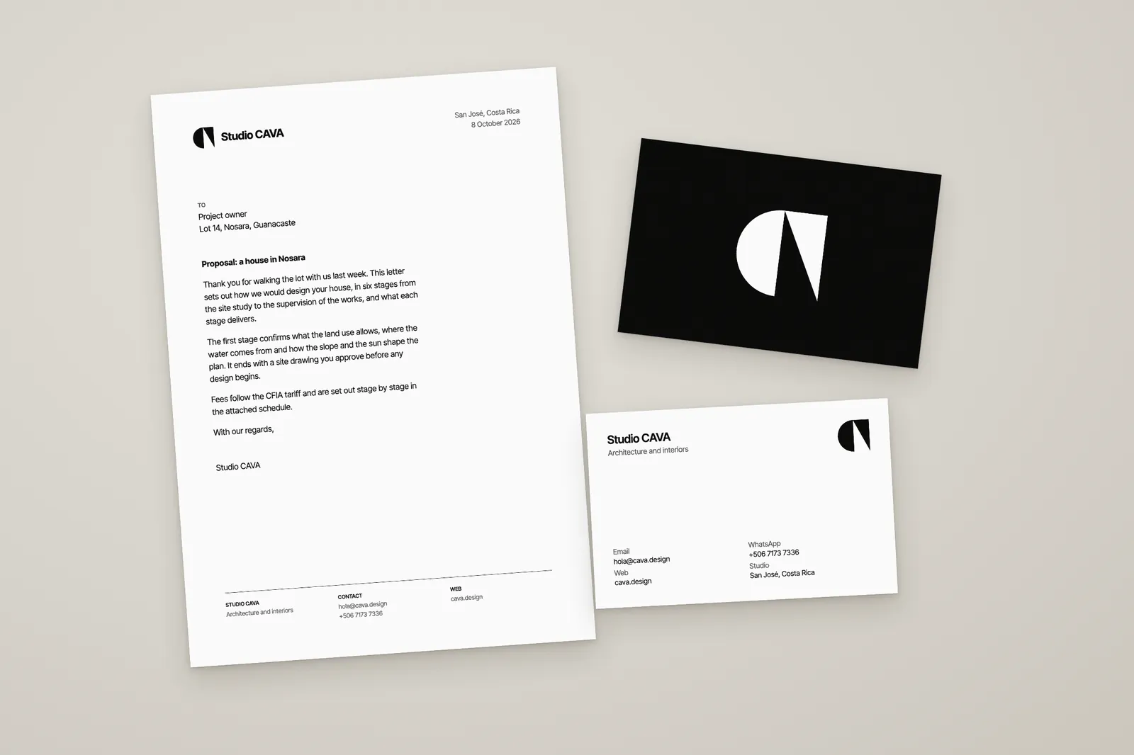
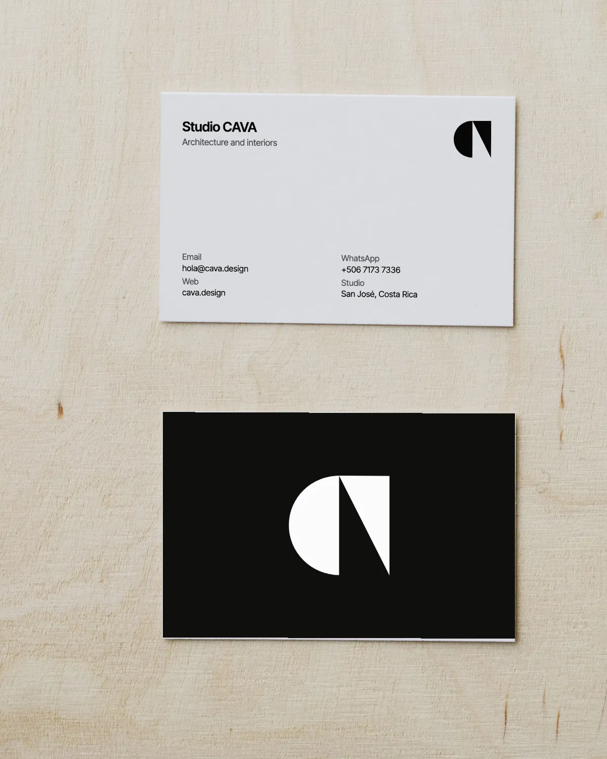
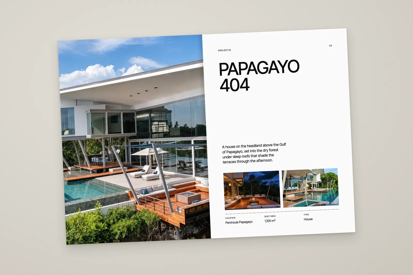
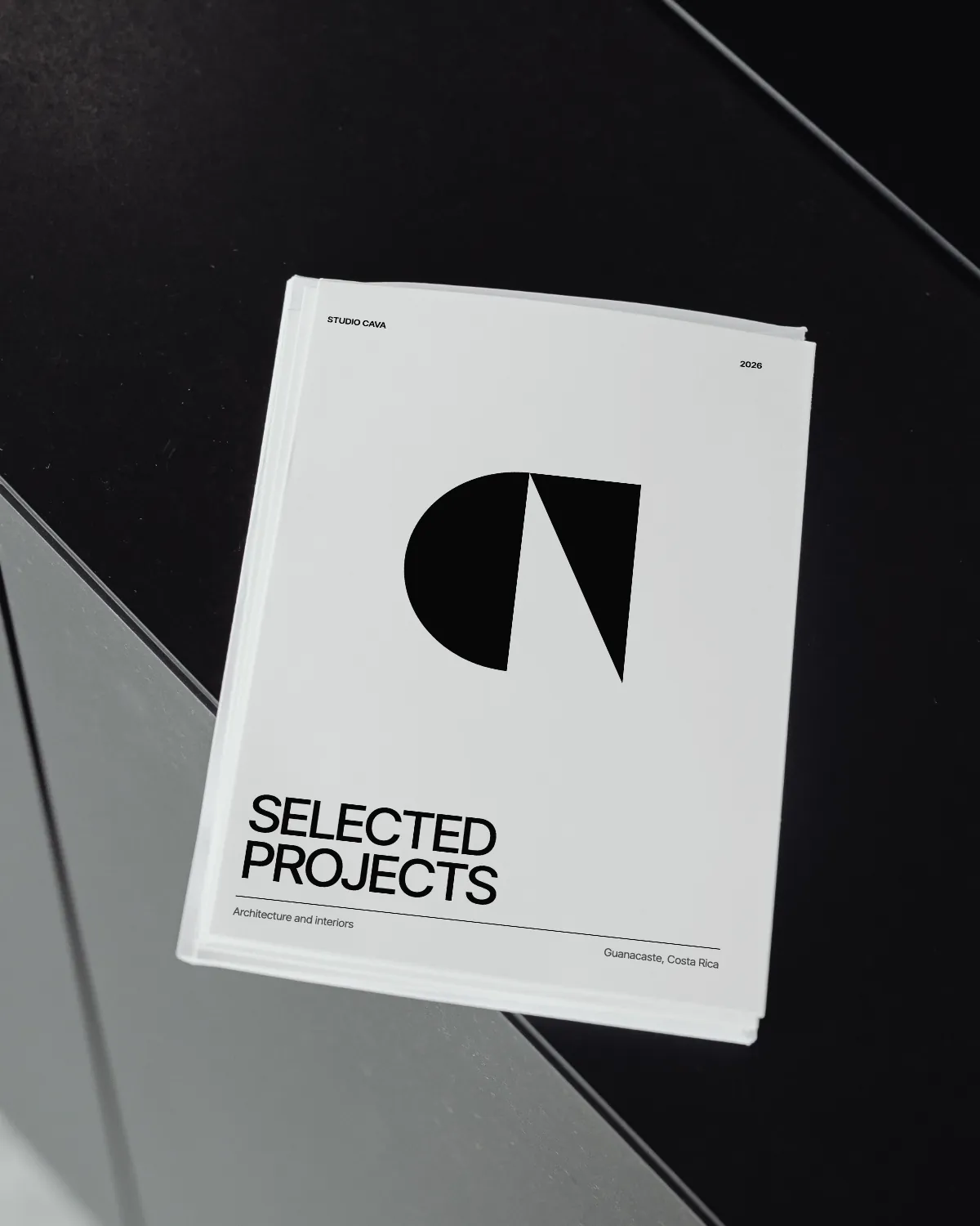
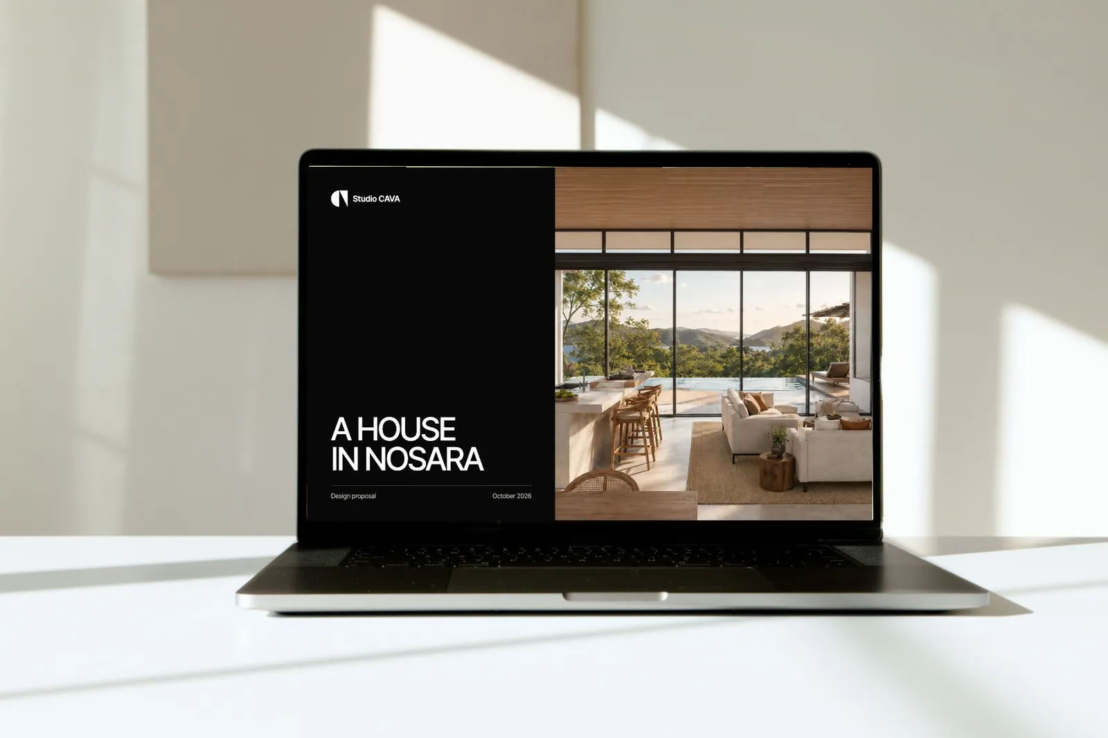
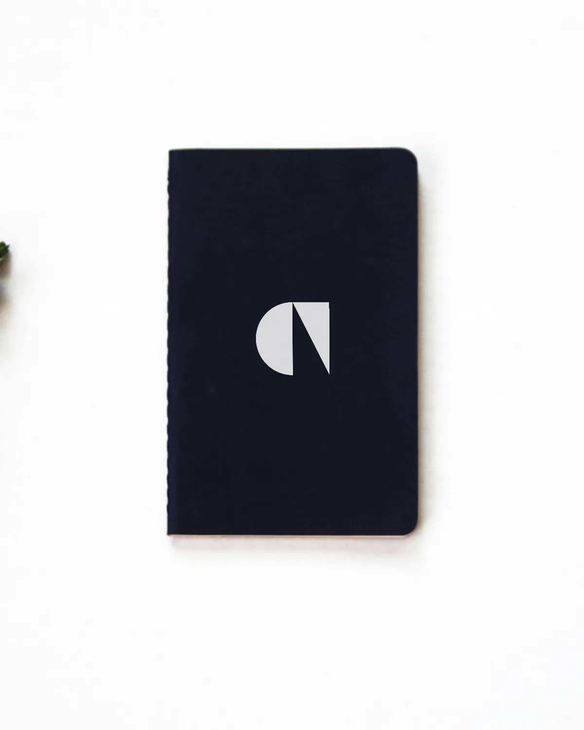
Where the mark meets people: the letter that goes with a proposal, the card left after a site visit, the book of projects, the first slide a client sees, and the things a team carries to site.
These are mock-ups, made on photographs of blank objects, to test the mark at every size before anything is printed.